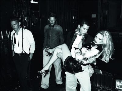


 I've no idea why I don't see alot of Mert and Marcus' work lately hopefully theyre still very sought after,but I love the colour of this ad.Monochrome with I think a lil bit of blue hue added,the blue certainly adds a "colder tone" to the pictures and I love the contrast.When it comes to managing colours the duo is still one of the most creative and interesting.
No comments:
Post a Comment